Visualizing Data from HR
Most companies would love to keep their valuable employees for a very long period of time, unfortunately this is not the case. Many employees walk off the door with very short or no notice, surpervisors are also not able to quickly anticipate these actions to revert them.
If employers can anticipate employees desire to leave, they would be better prepared to curb any negative outcome it would have on the company.
In this brief post we shall illustrate how to help a company reduce employee turn-over by providing valuable insight through visualization.
Problem Statement: The CEO of ADD consulting wants us to use their employee data to find out why and how people are leaving his company and also to make predictions on who would leave next.
Project Goal.
- I seek to briefly demonstrate how questions are asked from data
- To illustrate how to present insights through visualizations
Information Contained In The Data:
Satisfaction Level: The employee was asked to give a score on how happy he/she is in their current role
Last Evaluation: Recent work assessment from supervisors
Number of Projects A way of quantifying the job assigned to employees
Work accident: Indicates whether or not an employee had had an accident during work
promotion in 5 years: Indicates whether or not employee had a promotion in the last five years.
Department: Lists the various departmens in the company
Salary: shows the Income level of all employees
Time spent in the company: Number of years employee had been in the company
Average monthly hours Total hours worked per month
left: A label that tells who left or remained
So now we have the raw material to proceed with our analysis. The full reproducible code for this project is available here. In this post i’ll briefly outline some data cleaning that was carried out on the data.
- I changed some dummy variables into more meaningful values.
- I splitted some numeric variables into three equal intervals
| satisfaction_level | last_evaluation | number_project | average_montly_hours | time_spend_company | Work_accident | left | promotion_last_5years | sales | salary |
|---|---|---|---|---|---|---|---|---|---|
| 0.38 | 0.53 | 2 | 157 | 3 | 0 | 1 | 0 | sales | low |
| 0.80 | 0.86 | 5 | 262 | 6 | 0 | 1 | 0 | sales | medium |
| 0.11 | 0.88 | 7 | 272 | 4 | 0 | 1 | 0 | sales | medium |
| 0.72 | 0.87 | 5 | 223 | 5 | 0 | 1 | 0 | sales | low |
| 0.37 | 0.52 | 2 | 159 | 3 | 0 | 1 | 0 | sales | low |
| 0.41 | 0.50 | 2 | 153 | 3 | 0 | 1 | 0 | sales | low |
| 0.10 | 0.77 | 6 | 247 | 4 | 0 | 1 | 0 | sales | low |
| 0.92 | 0.85 | 5 | 259 | 5 | 0 | 1 | 0 | sales | low |
| 0.89 | 1.00 | 5 | 224 | 5 | 0 | 1 | 0 | sales | low |
| 0.42 | 0.53 | 2 | 142 | 3 | 0 | 1 | 0 | sales | low |
summary(hr_data)## satisfaction_level last_evaluation number_project
## disatisfied :1941 Min. :0.3600 2:2388
## partly_satified:6760 1st Qu.:0.5600 3:4055
## very_satisfied :6298 Median :0.7200 4:4365
## Mean :0.7161 5:2761
## 3rd Qu.:0.8700 6:1174
## Max. :1.0000 7: 256
##
## average_montly_hours time_spend_company Work_accident
## Min. : 96.0 less_than_3 :9687 0:12830
## 1st Qu.:156.0 between 4 and 7:4936 1: 2169
## Median :200.0 greater than 7 : 376
## Mean :201.1
## 3rd Qu.:245.0
## Max. :310.0
##
## left promotion_last_5years sales salary
## stayed:12830 promoted :14680 sales :4140 low :7316
## left : 2169 not_promoted: 319 technical :2720 medium:6446
## support :2229 high :1237
## IT :1227
## product_mng: 902
## marketing : 858
## (Other) :2923Summary:
About 14.5% of all staff in the data left
About 2.13% had not been promoted for the past five years
The average monthly hours of employee is 201.1
Why are people not happy with their job?
Remember we have a variable called “Satisfaction Level” - employees rank how happy they are in the company. I created three levels from that variable namely:
- dissatisfaction
- partly_satisfied
- very_satisfied
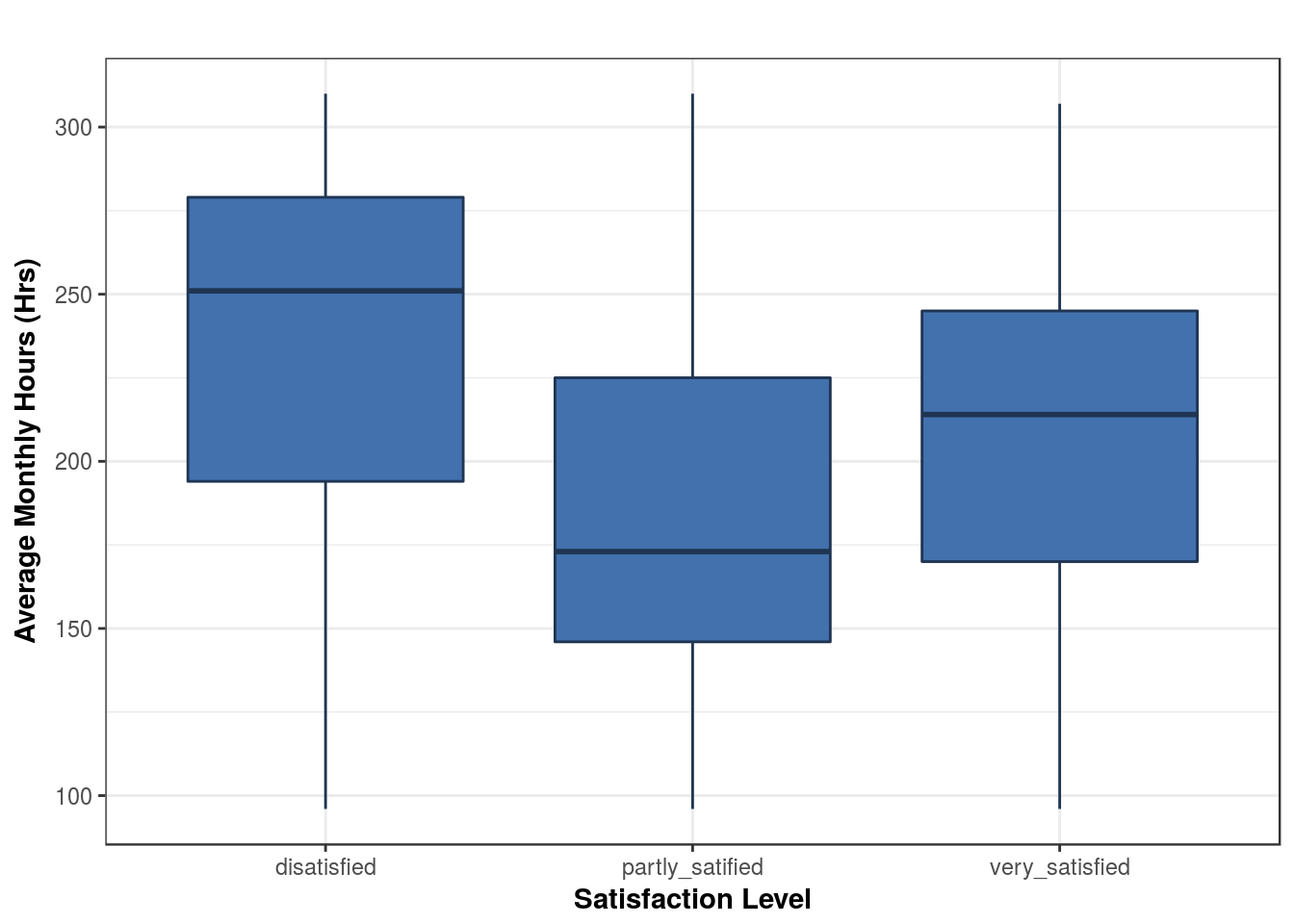
Our focus in the next plot would be targeted towards the dissatisfied group

Take a carefull look at the plot. What do you find? Majority of staff who claimed to be dissatisfied actually worked longer, some working as high as 300 hours a month.
Questions you could still ask:
- Why are they woking longer?
Long hours at work may not mean much if it doesn’t translate into more projects being completed
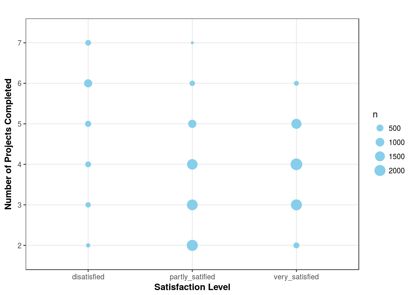
The next questions we seek to answer is: which group of employees completed more projects

For those employees who claim to be dissatisfied - not only are they working longer but they seem to be completing more projects.
What is the reward for their extra effort?, We have to find out how well they are paid and also check if they have beeen promoted You could plot satisfaction level against promotion in last 5 years
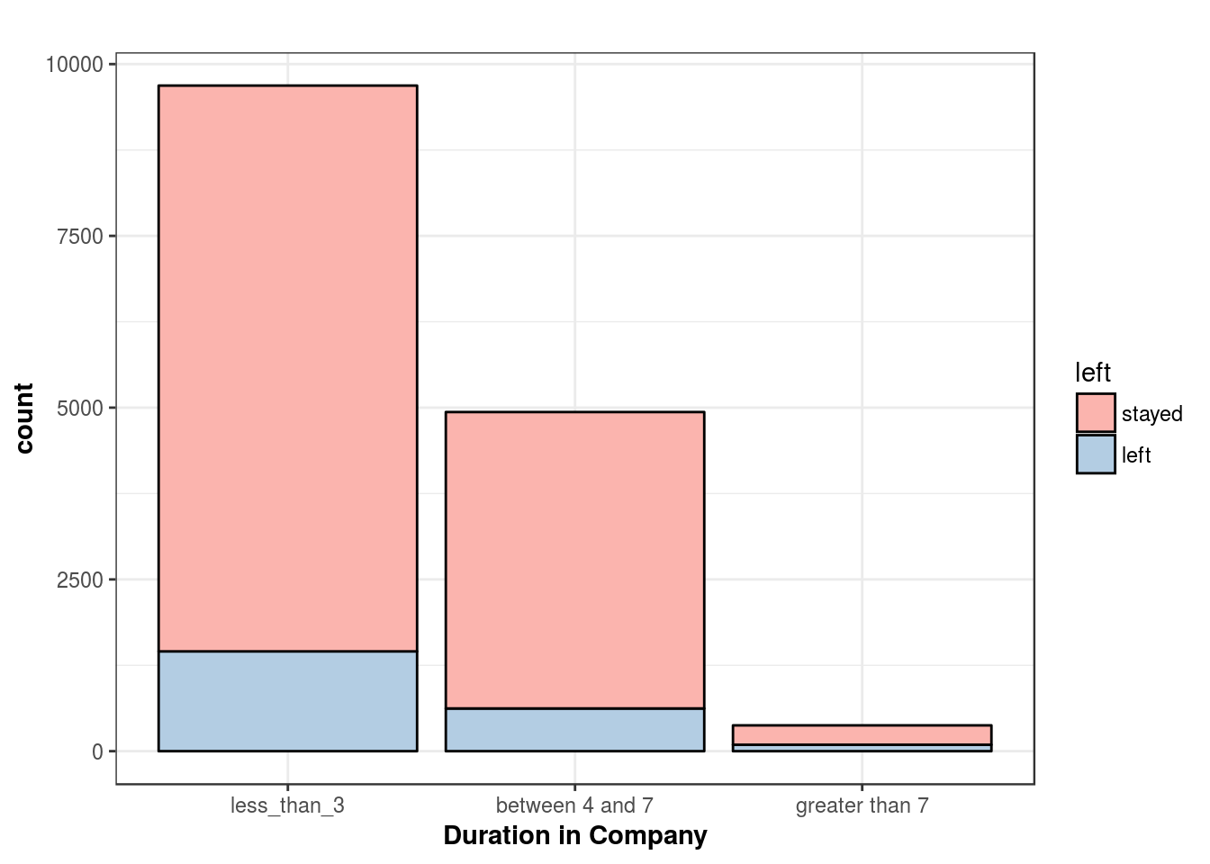
Let’s move on and find out how many long serving employees we still have left

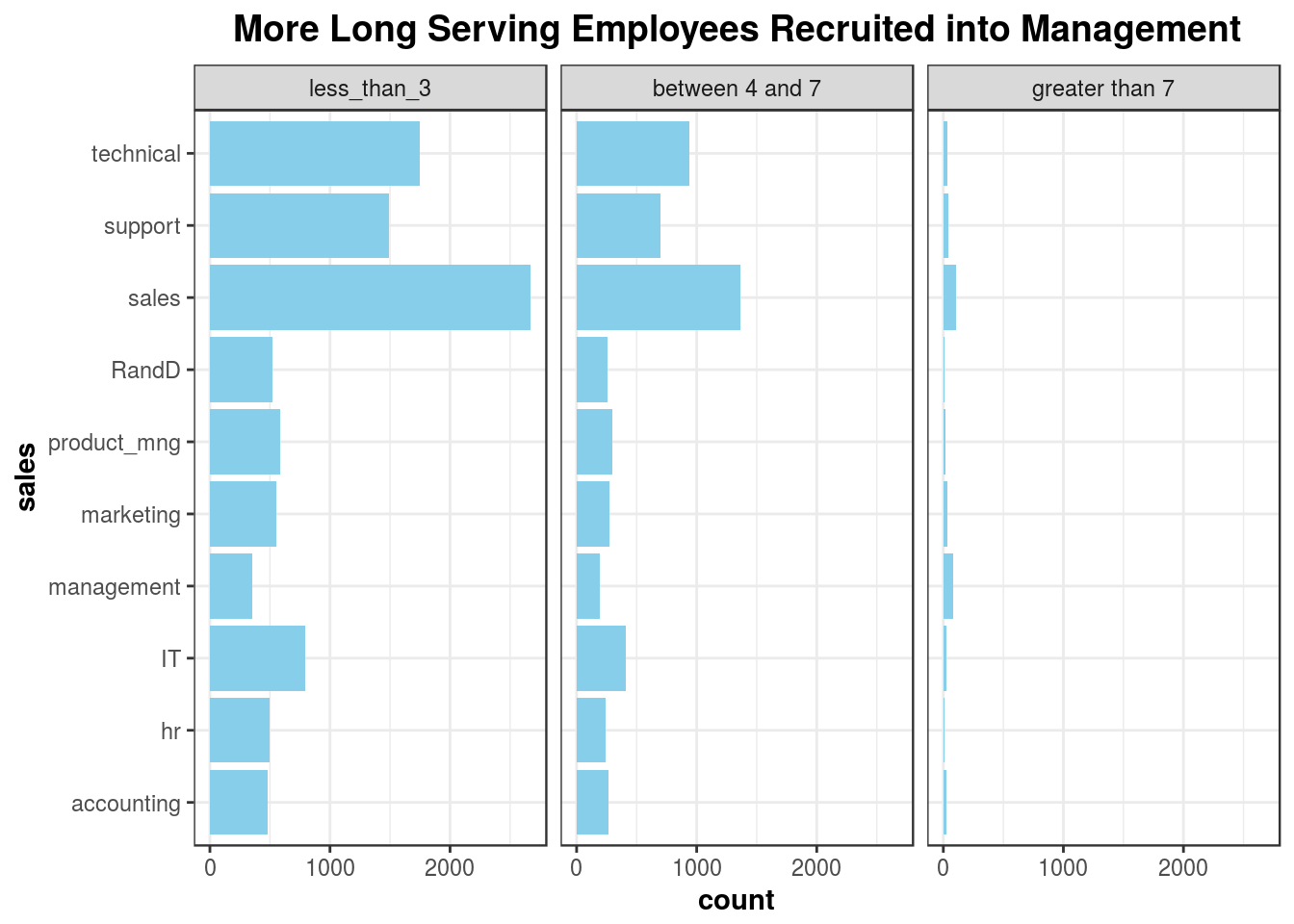
Very few employees stay longer than seven years and most of those employees are rewarded with higher positions
Our final plot verifies this claim:

Conclusion
Data visualization helps with presenting data in a clear and intuitive manner. The systematic approach to asking questions from data and answering those questions with beautiful plots is very crucial to any data analytic project. The full reproducible code to this project can be downloaded here.
Thanks for taking time to read - See you soon with more cool data stuff!
